The difference between a graphic tee that looks like part of an outfit and one that looks like a souvenir usually comes down to three things: how the shirt fits through the shoulders, what you put over it, and whether the rest of what you’re wearing argues with the print. Nothing about the shirt itself has to change. Styling a Slushy Bros graphic tee so it reads as clothing instead of merch is mostly a question of treating the print as an accent rather than the main event.
We design our shirts with that in mind, but the last 40% of the job happens in your closet. Here’s how to handle it.
What Actually Makes a Shirt Read as Merch
Before fixing anything, it helps to know what the eye is reacting to. People don’t clock a shirt as merch because of the logo. They clock it because of a handful of signals that tend to show up together.
- A print that fills the chest, roughly 12 inches wide or more, centered and sitting high.
- A thin, papery blank in the 4.3 to 5 oz range that clings in the wrong places and loses its shape after a few washes.
- Text plus a handle or URL, which turns the shirt into signage.
- A collar that’s already curling, usually a sign of a cheap single-stitch neckline.
- A color nobody wears otherwise, like safety orange or royal blue, chosen because it photographs well on a product page.
Kill two or three of those signals and the shirt stops announcing itself. That’s part of why we’re picky about blanks and print placement in the first place, something we got into at length in our post on why we don’t want Slushy Bros clothing to feel like YouTuber merch.
Fit Does About Half the Work
A good print on a badly fitting tee still looks like merch. A loud print on a tee that fits right starts looking like a design choice. The fastest upgrade most people can make costs nothing, because it’s just paying attention to where the seams land.
- Shoulder seam: should sit at the edge of your shoulder bone or slightly past it. If it’s halfway down your bicep on a tee that isn’t cut boxy on purpose, the shirt is too big.
- Body length: hits around the middle of your fly. Much longer and you lose your waistline, which is what makes a tee look sloppy with shorts.
- Sleeve: ends mid-bicep, not at the elbow.
- Weight: 5.5 to 6.5 oz cotton holds a shape and hangs instead of clinging. Heavier fabric also keeps the print from telegraphing through in bright light.
If you’re between sizes and the shirt is a boxy cut, size down. If it’s a standard retail cut and you want the relaxed look, size up one and accept that you’ll be tucking the front.
Layering Moves That Cover Just Enough of the Print
Covering part of a graphic is the oldest trick there is, and it still works because partial information reads as intriguing while full information reads as advertising. You want roughly 40 to 60 percent of the print visible.
- Open overshirt or flannel: the vertical edges frame the graphic and cut its apparent width in half. Works with almost any print size.
- Crewneck sweatshirt worn over: only the bottom couple inches of the shirt and the print’s lower edge show. Low effort, cold weather friendly.
- Denim or chore jacket: heavier structure balances out a big graphic. Keep it unbuttoned.
- Zip hoodie at half zip: gives you a narrow window of print, which is usually the most wearable version of a loud design.
One caution: if the graphic is small and chest-left, don’t layer over it. You’ll hide the whole thing and end up wearing a plain tee under a jacket, which defeats the point.
Color Pairing That Keeps It Looking Deliberate
Pull one color out of the print and repeat it somewhere else in the outfit. Shoes, a cap, the stripe on a sock, whatever. That single repetition is what signals to anyone looking that the shirt was chosen rather than received in a mailer.
We cover this topic in more depth in The Best Vintage-Inspired Graphic Tees for People Who Hate Boring Shirts.
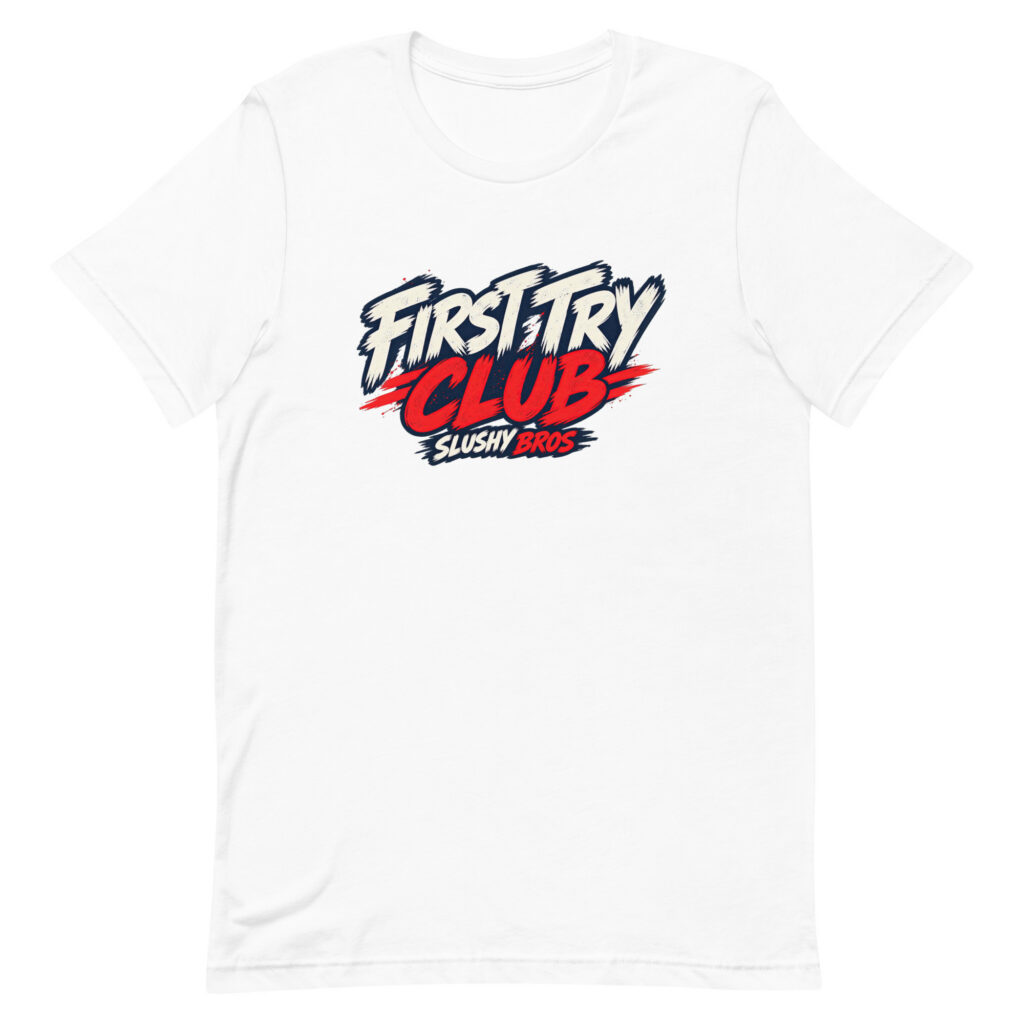
Beyond that, keep the rest neutral. A rough split that works: about 60 percent neutral base (jeans, khakis, black pants), 30 percent secondary layer, and 10 percent the color of the graphic. Our He Got It In On the First Try design is a good example, since the print carries one dominant accent you can echo in a sneaker without thinking too hard.
Washed and garment-dyed tees are easier to style than bright white or true black, because faded colors read as worn-in rather than promotional.
Three Outfit Formulas That Hold Up
- The default: graphic tee, straight-leg jeans in a mid or dark wash, low-profile sneakers in white or off-white, front hem tucked about two inches. Takes nine seconds and works for 80 percent of situations.
- The layered version: same tee, open flannel or canvas overshirt, loose chinos, boots. Add a beanie in winter. This one carries a loud print better than anything else on the list.
- The warm weather version: tee untucked, 7 to 9 inch inseam shorts, crew socks, running sneakers or slides. The only rule here is that the shorts stay a solid neutral so the print isn’t competing.
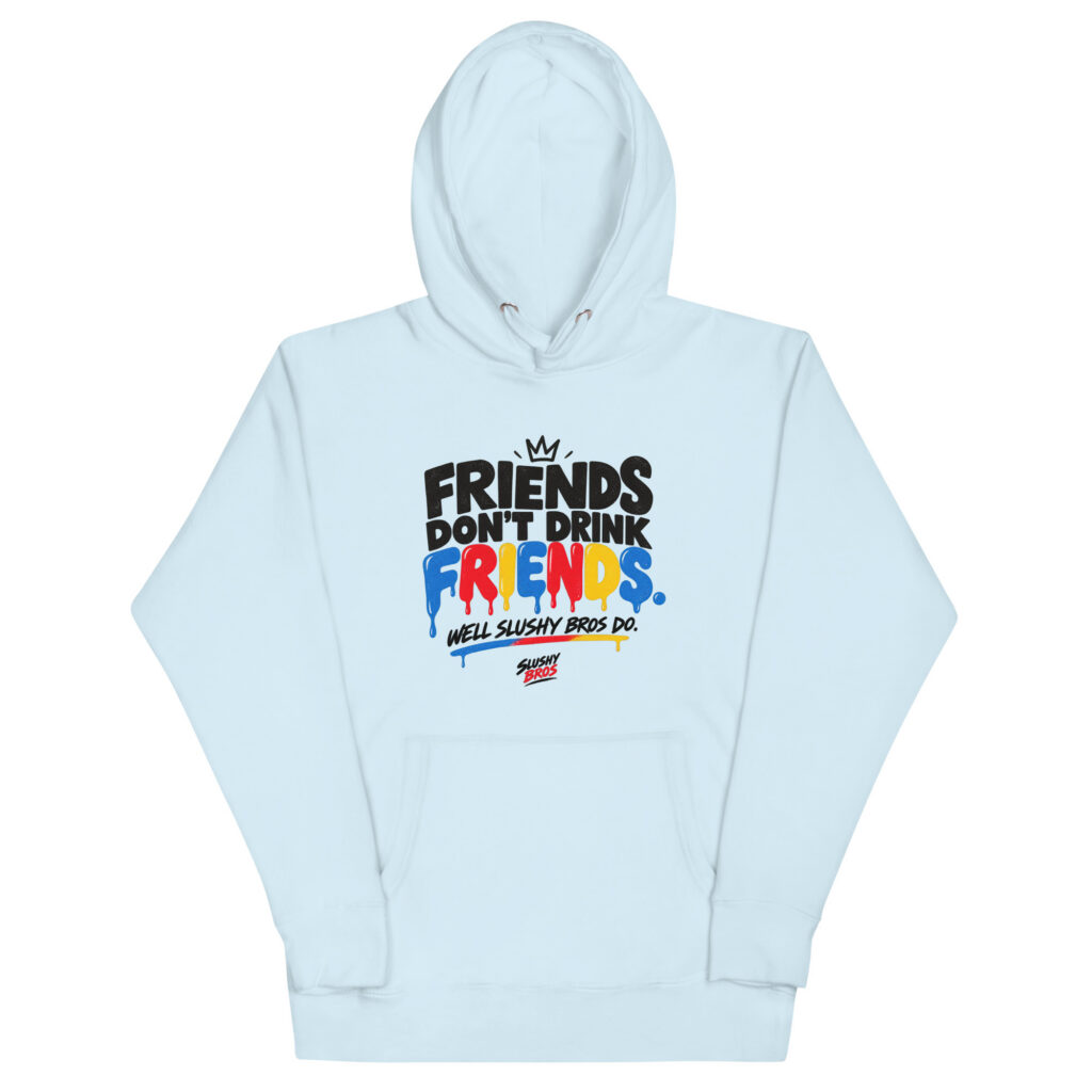
Our Friends Don’t Drink Friends shirt is the one people ask about most, probably because the line works on its own without context. Text-based designs like that one are actually the easiest to style, since text has a clean rectangular footprint that layers predictably.
Small Adjustments Most People Skip
These are the details that separate someone who happens to be wearing a graphic tee from someone who clearly got dressed on purpose.
- Front tuck: tuck only the center front panel, roughly three to four inches of fabric. Restores a waistline without looking formal.
- Sleeve roll: one fold, one to one and a half inches, no more. Two folds starts looking like a costume.
- Hem taper: if a tee is boxy and long, a customize can shorten it for about $12 to $20 in most cities. Worth it for a shirt you actually wear weekly.
- Collar check: iron or steam the neckline flat before wearing. A curled collar reads cheap faster than anything else.
Washing It So It Doesn’t Degrade Into Merch
A tee that fit correctly in March can look like a giveaway shirt by August if you dry it on high heat every week. Cotton shrinks most in the dryer, not the wash, and screen prints crack when they get repeatedly baked.
- Wash inside out, cold, on a normal cycle. The U.S. Department of Energy notes that about 90 percent of a washer’s energy goes to heating water, so cold cycles protect the print and your bill at once.
- Hang dry or tumble on low. Expect 3 to 5 percent shrinkage on untreated cotton with high heat.
- Skip fabric softener on printed shirts. It builds up on the ink and dulls it.
- Follow the care label, which manufacturers are legally required to provide accurately under the FTC’s Care Labeling Rule.
When to Stop Hiding the Graphic
There are days when the shirt should be loud. Meetups, game days, conventions, filming with friends, anywhere the reference is the point. In those settings a half-covered print is the wrong call, because the whole social function of the shirt is being recognized across a parking lot.
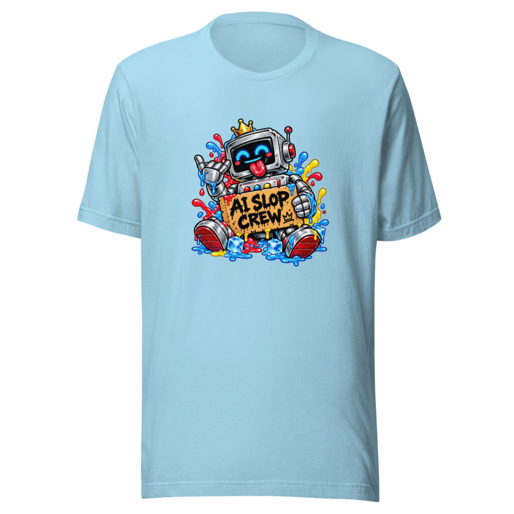
Context decides it. The same tee that gets layered under a chore coat on a Tuesday can be the centerpiece on a Saturday, and designs with a sharper in-joke, like our AI Slop shirt, land better when they’re fully visible to people who get it.
Frequently Asked Questions
What Size Should I Order for a Relaxed Look?
Size up exactly one from your normal fit, not two. One size adds roughly an inch of chest width and half an inch of body length, which gives you drape without losing the shoulder seam position that keeps the shirt from looking borrowed.
Can You Wear a Graphic Tee to a Business Casual Office?
In most casual-leaning offices, yes, if it’s layered under an unstructured blazer or overshirt and paired with chinos or dark denim. Keep the visible portion of the print under about six inches wide and skip anything with profanity or a long text block.
Do Graphic Tees Look Better Tucked or Untucked?
Front-tucked, about three to four inches, works in the widest range of situations. A full tuck tends to look dressed-up in a way that fights the print, and fully untucked only works cleanly when the hem lands at mid-fly or higher.
How Long Should a Good Printed Tee Last?
A 6 oz cotton tee with a water-based or properly cured plastisol print should hold up through 50 or more wash cycles with minimal cracking if you wash cold and avoid high-heat drying. Thinner 4.3 oz blanks usually start showing wear around 20 to 25 washes.
What Colors Are Easiest to Style?
Washed black, heather grey, cream and faded navy pair with the widest range of bottoms and layers. Bright primary colors are the hardest, since they force the rest of the outfit to stay completely neutral.
Find a Shirt You’d Wear Without the Context
Every design we release has to pass one test: would someone wear it if they’d never seen the video? Browse the current Slushy Bros apparel lineup and see which ones clear that bar for you.