A good vintage-inspired graphic tee does one thing a plain shirt never will: it starts a conversation before you open your mouth. The best ones feel broken in from day one, print soft instead of plasticky, and carry artwork weird enough that someone squints at your chest in line for coffee. Here is what actually separates those shirts from the stack of forgettable blanks in your drawer.
What Makes a Shirt Read Vintage Instead of Just New
Vintage is a texture before it is a design. Shirts from the 70s and 80s used lighter ringspun cotton, inks that cracked and faded with wear, and screen setups that left soft, slightly imperfect edges. Modern reproductions chase that look on purpose, and the good ones get three things right.
- Fabric weight: roughly 4.2 to 5.3 ounces per square yard. Heavier than that and the shirt feels like a uniform, lighter and it goes see-through after a summer.
- Ink type: water-based or discharge inks sink into the cotton instead of sitting on top, so the graphic moves with the fabric rather than peeling off it.
- Distress and halftone: faint speckling, dot patterns and gentle fading in the artwork itself, which mimics ink that has been washed 200 times.
If a shirt is stiff in the print area when you pick it up, it was almost certainly printed with thick plastisol and it will crack in about a year. The t-shirt only became standalone outerwear in the mid-20th century, and the history of the garment is basically a story of underwear getting a personality.
The Actual Problem With Boring Shirts
Most people do not hate t-shirts. They hate the two default options: a blank in a color that already exists in their closet, or a shirt with a giant corporate logo doing free advertising. Neither says anything about the person wearing it.
The middle lane is where retro graphic tees live. Artwork that looks like it was pulled off a flea market rack, printed on something soft, with a joke or a reference that rewards whoever gets it. That is a very different experience from wearing a brand name across your chest in 48-point type.
Five Vintage Graphic Styles Worth Building Around
If you are rebuilding a tee rotation, think in categories rather than individual shirts. These five cover most of what makes vintage graphics fun without turning your closet into a costume shop.
- Faux tour and event tees. Back-print tour dates for a tour that never happened, or a festival nobody attended. The format is instantly readable and the fake details are the whole joke.
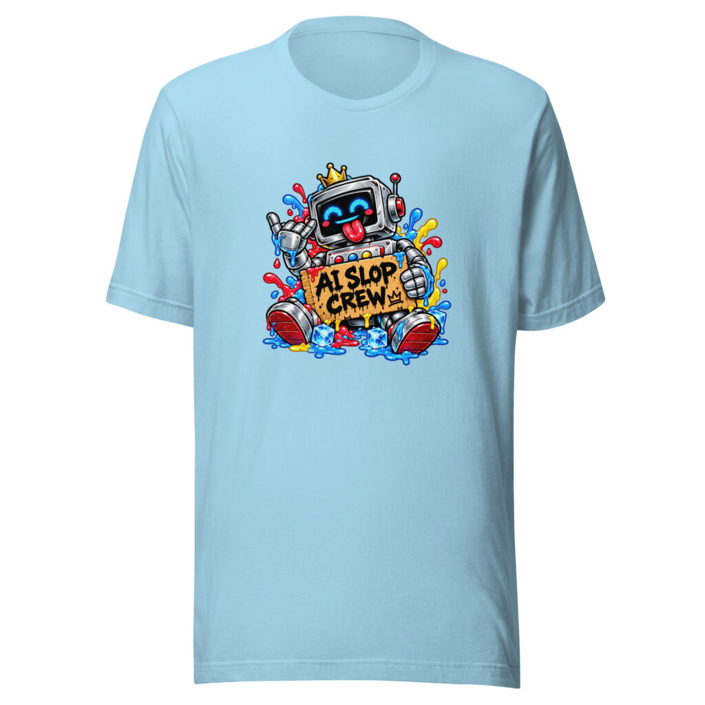
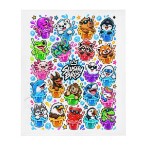
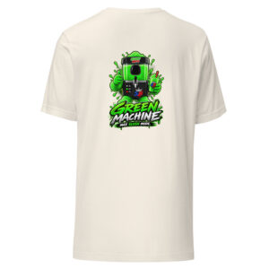
- Mascot and character art. Hand-drawn figures with thick outlines and off-register color, the way old cereal box art and little league shirts looked.
- Fake local business. Bait shops, bowling alleys, small-town plumbers, towing companies. Nothing says vintage like a phone number with no area code.
- Retro sports graphics. Collegiate arches, varsity numbering and faded team crests that were never affiliated with any real team.
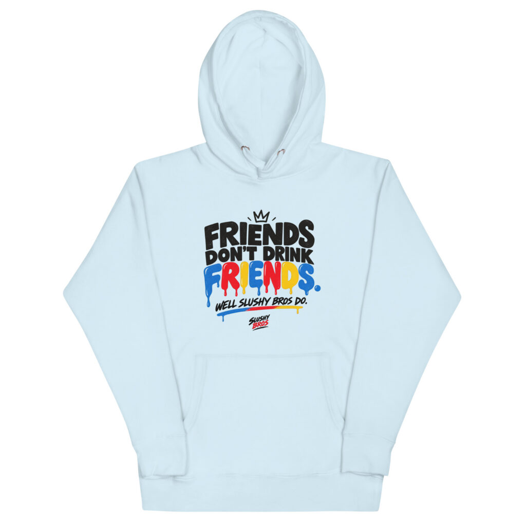
- Absurd slogan tees. A funny line in a serif font from 1983, set on heathered gray, with zero explanation. These age better than meme shirts because the humor is not tied to a trend cycle.
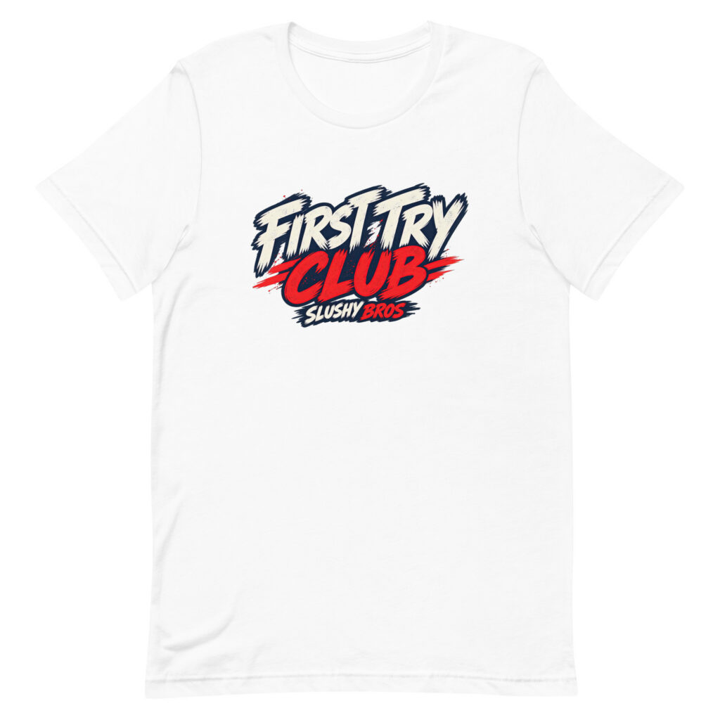
Our own catalog leans hard on the last two, which is why the Slushy Bros apparel collection ends up with so many shirts that look like they came from a sponsored softball team in 1986.
How to Judge a Vintage Tee Before You Buy It
Product photos flatten everything, so you have to read the listing like a spec sheet. These are the details worth hunting for.
- Cotton type. Combed and ringspun cotton is softer and more durable than open-end carded cotton, which is what most $6 blanks use.
- Blend ratio. 100% cotton gives the most authentic hand feel. A 50/25/25 tri-blend drapes softer and resists shrinking but reads more modern.
- Garment dye vs. piece dye. Garment-dyed shirts fade unevenly over time, which is a feature if you want that worn-in look.
- Print dimensions. A listed print width of 11 to 14 inches usually looks right on an adult tee. Anything under 8 inches tends to look lost on the chest.
- Flat measurements. Chest width and body length in inches beat S/M/L labels every time, since sizing varies by two full inches between brands.
One practical trick: lay a shirt you already love flat, measure pit to pit and collar to hem, then compare those two numbers to the size chart. It takes 30 seconds and eliminates most return headaches.
Fit Is Half the Vintage Look
A perfect graphic on a bad silhouette still looks like a souvenir shirt. True vintage tees ran boxier through the body with a shorter length and a slightly wider sleeve opening, which is why modern slim-fit cuts never quite capture the same vibe.
Look for a body length roughly 1 to 2 inches shorter than your usual tee and a chest measurement 2 to 4 inches wider. If you prefer a cropped-at-the-belt look, that combination does it without you touching a pair of scissors. We get into the rest of the outfit math in our guide on styling a graphic tee so it does not read as merch.
Keeping the Fade Good Instead of Just Old
There is a difference between a shirt that has aged nicely and one that has been destroyed by a dryer. The print is almost always the first casualty, and heat is almost always the cause.
- Wash inside out in cold water, which also cuts the energy used per load by a wide margin according to the U.S. Department of Energy.
- Skip fabric softener on printed cotton. It coats fibers and dulls both the color and the hand feel.
- Tumble dry low or hang dry. High heat shrinks cotton roughly 3 to 5% and bakes cracks into the ink.
- Do not iron directly over a graphic. Flip the shirt or put a cloth between the iron and the print.
Follow that and a well-printed shirt holds up for five to seven years of regular wear, slowly softening into the thing you reach for first.
Where Our Shirts Land in All This
Every design we print starts as something stupid that happened on camera, which is a different process than a designer picking a trend off a mood board. The characters came first, the shirts came second, and if you want the backstory on the loudest one, there is a whole piece on Red and his questionable leadership.
We print on soft ringspun cotton with retro-leaning artwork because that is what we wanted to wear ourselves. If you are buying for someone else, the gifting page narrows things down by personality instead of size chart.
Frequently Asked Questions
What Is the Difference Between Vintage and Vintage-Inspired Tees?
Vintage means the shirt was actually manufactured 20 or more years ago, while vintage-inspired means a new shirt designed to look that way. Authentic vintage tees often cost $40 to $300 depending on the band or event, and they come with unpredictable holes, stains and sizing. Vintage-inspired versions give you the aesthetic in your actual size.
How Much Should a Good Vintage Graphic Tee Cost?
Expect $28 to $45 for a quality printed tee in 2026. Below about $20 you are usually getting carded cotton with plastisol ink, and above $60 you are typically paying for a fashion label rather than better construction.
Do Vintage-Inspired Shirts Shrink?
Most 100% cotton tees shrink 3 to 5% in length after the first hot wash, which is roughly one inch on an adult medium. Pre-shrunk and garment-dyed shirts move less, and cold washing with low-heat drying keeps shrinkage close to zero.
Are Graphic Tees Still in Style in 2026?
Yes, and the retro end of the category has been growing for several years as secondhand and nostalgia-driven fashion keeps expanding. The shift has been away from loud logo shirts toward faded, illustrated and joke-driven designs that look like they were found rather than bought.
What Color Vintage Tee Is Most Versatile?
Heather gray and faded black work with the widest range of outfits, followed by washed navy and cream. Those four shades also make distressed prints read as genuinely worn instead of artificially aged.
Find a Tee Worth Putting in the Rotation
Our shop stays small on purpose, with designs that come out of actual videos instead of a trend calendar. Browse the current Frozen collection and grab whatever makes you laugh in the thumbnail.